Introduction
Color psychology plays a vital role in graphic design, influencing emotions, perceptions, and actions. Whether you’re designing a brand logo, a website, or marketing materials, understanding how colors affect your audience can make a significant difference in engagement and conversions. This guide will walk you through how to use color psychology effectively in graphic design, covering key principles, step-by-step strategies, and expert insights to enhance your visuals.
Understanding Color Psychology in Graphic Design
Color psychology studies how different hues influence emotions, behaviors, and perceptions. In graphic design, colors create brand identity, evoke moods, and guide users’ attention. For example:
- Red: Creates urgency, passion, and excitement (used by brands like Coca-Cola).
- Blue: Represents trust and professionalism (seen in Facebook and LinkedIn).
- Yellow: Evokes happiness and optimism (used by McDonald’s).
- Green: Symbolizes nature, health, and sustainability (Starbucks).
- Black & White: Reflect luxury, elegance, and minimalism.
Using the right color combinations ensures brand consistency, user engagement, and improved readability.
Step-by-Step Guide: How to Use Color Psychology in Graphic Design
Identify Your Brand’s Emotion & Message
Before choosing colors, define the emotions you want your brand to evoke. Do you want to inspire trust, excitement, or creativity? Selecting colors that align with your brand values ensures consistency across all visual elements.
Understand the Target Audience
Different cultures and demographics perceive colors differently. For example, while white symbolizes purity in Western cultures, it represents mourning in some Asian cultures. Researching your audience helps in making informed color choices.
Choose a Primary Color
Pick a dominant color that reflects your brand’s personality. If you’re designing for a corporate brand, shades of blue convey trust and reliability, whereas creative brands might prefer vibrant colors like orange or purple.
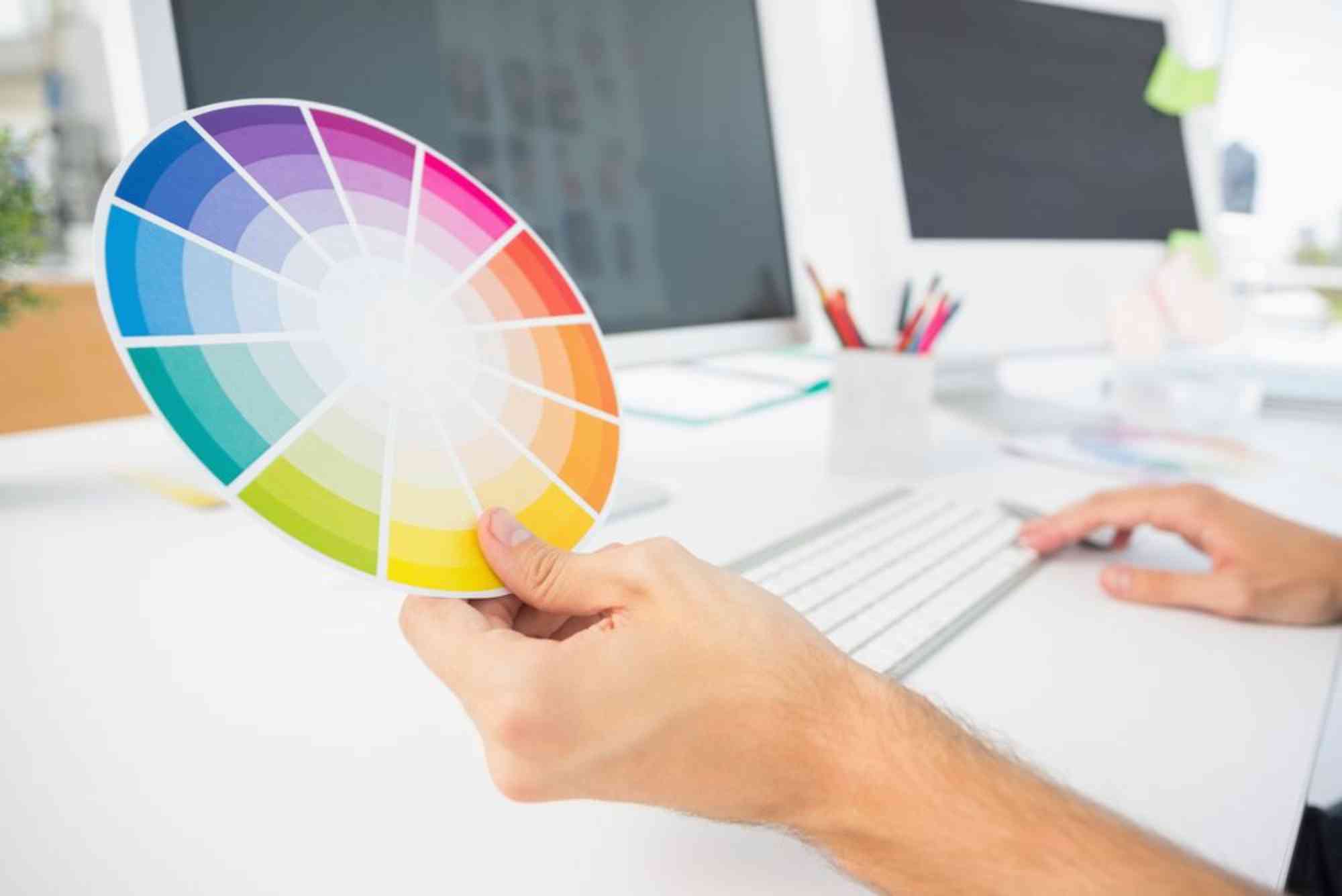
Create a Color Palette with Harmonious Combinations
A well-balanced color palette enhances design aesthetics and user experience. You can use color theory principles such as:
- Complementary Colors (opposite on the color wheel, e.g., blue and orange) for contrast.
- Analogous Colors (next to each other, e.g., blue, teal, and green) for harmony.
- Triadic Colors (equally spaced, e.g., red, blue, and yellow) for vibrancy.
Apply Colors Strategically in Design
- Use bold colors for CTAs (Call-to-Action buttons).
- Maintain background and text contrast for readability.
- Limit the number of colors to avoid overwhelming designs.
Test and Optimize for Better Performance
A/B testing different color schemes can help determine which colors drive the most engagement and conversions. Platforms like Google Optimize allow designers to analyze performance and refine designs based on user interactions.
Best Practices for Using Color Psychology in Graphic Design
- Keep It Simple: Stick to 2-3 primary colors to maintain visual harmony.
- Prioritize Readability: Ensure high contrast between text and background.
- Consider Accessibility: Use tools like WebAIM to ensure colorblind-friendly designs.
- Stay Consistent Across Platforms: Maintain the same color scheme in branding, websites, and social media.
Best Color Combinations for Graphic Design
Here are the best color combinations for impactful graphic design:
- Black & Gold – Luxurious and elegant.
- Navy Blue & White – Professional and trustworthy.
- Red & Yellow – Energetic and attention-grabbing.
- Green & Brown – Natural and earthy.
- Purple & Pink – Creative and playful.
Each combination creates a unique mood and influences customer perception effectively.
Why Color Psychology Matters in Branding & Marketing
Top graphic design companies use color psychology to create memorable brand experiences. Choosing the right colors can:
- Increase brand recognition by up to 80%.
- Improve conversion rates on websites and advertisements.
- Enhance emotional connection with customers.
If you’re looking for expert design services, check out Graphic Design Company for professional branding solutions.
FAQs About Color Psychology in Graphic Design
1. What is the best color for a brand logo?
The best color depends on your brand’s personality and target audience. For professionalism, blue works best. For energy and urgency, red is ideal.
2. How does color impact website conversions?
Studies show that changing CTA button colors (e.g., red to green) can significantly impact user engagement and sales.
3. What colors should I avoid in design?
Overusing neon colors, poor contrast combinations (e.g., yellow text on a white background), and too many colors can make designs visually overwhelming.
4. Is there a universal color that works for all brands?
No single color fits all brands. However, blue is widely used due to its association with trust and professionalism.
5. Where can I find professional graphic designers in Dubai?
For expert design services, visit Digital Ranker Dubai or explore the Digital Ranker Dubai Location.
Color psychology is a powerful tool in graphic design, impacting emotions, brand perception, and customer behavior. By strategically selecting and applying colors, designers can create visually appealing, high-converting designs. Whether you’re building a brand, website, or marketing campaign, using color psychology effectively ensures better engagement and success.
For expert design assistance, contact Graphic Design Company today!