
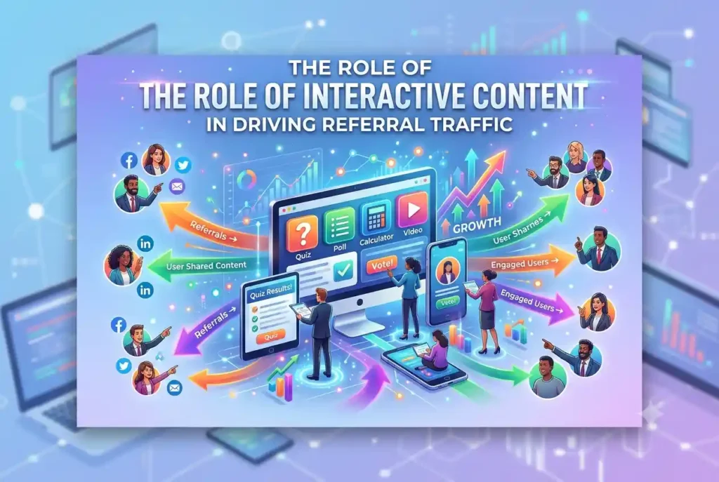
Most online content asks people to sit still and read. That is fine when somebody needs a quick answer, but it does not always give them a reason to stay, share the page, or mention it on another website. An interactive tool changes that relationship by asking the visitor to participate.
The difference can be substantial. A Mediafly analysis reported by the Content Marketing Institute found that interactive content attracted 52.6 per cent more engagement than static content, while buyers spent an average of 13 minutes with it compared with 8.5 minutes for static material. Those figures describe one analysis rather than a guaranteed result for every campaign, but they show why calculators, quizzes, maps, and configurators deserve serious attention.
Referral traffic is the traffic that reaches your site through a link on another domain. Interactive content can generate it in several ways: publishers cite a useful tool, users share personalised results, website owners embed an asset, or a partner promotes something you created together. Each route starts with the same human-first principle: the experience must solve a real problem before it can earn a meaningful click.
You do not need to build a complex application on day one. A focused calculator based on a reliable spreadsheet can be more valuable than an expensive game with no clear purpose. The idea, inputs, output, and next step matter far more than visual novelty.
Interactive Tools That Other Websites Link To
A genuinely useful tool is a little like the only accurate measuring tape in a shared workshop. People keep borrowing it, and eventually they tell others where it came from. Online, that recommendation takes the form of a link.
The strongest ideas usually sit where your audience faces uncertainty. A removal company could estimate van space, a software firm could calculate migration time, and an energy adviser could compare household costs. Instead of publishing another general article, you turn your expertise into a result the visitor can apply to their own situation.


A practical example comes from an EV savings calculator that agency Fractl created for Payless Power. Users can compare the cost of running an electric vehicle with a petrol vehicle using factors such as location, model, mileage, and local energy rates. A motoring writer or regional publisher can link to that tool because it gives readers a useful next step rather than repeating information already in the article.
Start by interviewing customer-facing colleagues. Ask which questions make prospects reach for a calculator, open a spreadsheet, or say, “It depends.” Repeated questions about price, time, capacity, suitability, or risk are good candidates because an interactive answer can reduce work for the visitor and your team.
The Nielsen Norman Group divides online calculators and quizzes into three broad types: conversion, prediction, and recommendation. A unit converter changes one value into another, a retirement calculator predicts a possible outcome, and a product finder recommends an option. Choose the type that matches the decision your visitor is actually trying to make.
The calculation itself needs to withstand scrutiny. Explain where the inputs come from, show the assumptions, state when the data was updated, and give the user enough information to understand the result. False precision is particularly risky in finance, health, insurance, and legal topics, often described as “Your Money or Your Life” subjects because errors can affect a person’s wellbeing or financial security.
Build the smallest version that provides a complete answer. Test it with real customers, subject specialists, and people who have never seen the project. If users need an explanation beside every field or consistently misread the output, the tool is not ready for promotion, however polished it looks.
Once the experience works, make it easy to cite. Give the tool a permanent, descriptive URL, add a short explanation of its purpose, and provide a plain-language methodology. Then approach publishers whose existing articles would genuinely improve with the resource, pointing to the exact reader problem it solves rather than sending a generic link request.
Quality is what separates a linkable asset from an elaborate lead form. A publisher is unlikely to recommend a calculator that hides the answer, exaggerates accuracy, or pushes a product at every step. Help the reader first, and let your brand earn attention through the usefulness of the result.
Shareable Quiz and Calculator Results That Bring New Visitors
A good result page is a digital souvenir. It gives somebody a concise, personal outcome they can keep, compare, and show to another person. That is why the result often has more referral potential than the questionnaire that produced it.
Quizzes work well when the outcome helps a user describe themselves or make a decision. A retailer might recommend a product category, a training provider might identify a skill gap, and a B2B consultant might assess operational maturity. The result needs to be specific enough to feel personal without pretending that a short quiz can diagnose something it cannot.
Fractl reports that a relationship quiz produced for ZipHealth earned links from three referring domains in under two months. That is a modest, transparent example rather than evidence that every quiz goes viral. Its value lies in showing how a sensitive topic can be turned into an approachable experience with personalised conversation prompts.
Give every outcome a clear name, a brief explanation, and one useful next action. If there are four possible results, each should feel distinct and credible rather than being the same sales message with a different heading. People share results that help them express something, not results that read like an advert.
Calculators create a different sharing pattern. A manager may send an ROI estimate to a finance colleague, a homeowner may share a renovation budget with a partner, or an adviser may use a saved result in a client conversation. These private journeys can be commercially valuable even when they never appear in a public social feed.
Marketers sometimes call this “dark social,” meaning links shared through private channels that analytics cannot reliably connect to a visible post or website. Do not mistake an unattributed visit for an unimportant one. Add a simple “copy result link” control and use privacy-conscious, non-identifying sharing URLs so the recipient can reopen the relevant output.
The result should appear before an optional email request unless contact details are genuinely required to provide the service. The Information Commissioner’s Office says personal data should be adequate, relevant, and limited to what is necessary for the stated purpose. Asking for a name, telephone number, job title, and company size merely to reveal a quiz result creates friction and raises questions about what you intend to do with the data.
If you offer to email a report, say exactly what the user will receive and whether they are also joining a marketing list. Keep consent choices clear and separate. Transparency may produce fewer form submissions than an automatic opt-in, but the contacts you do gain will understand the exchange and are more likely to trust the follow-up.
Measure sharing as a journey rather than a button click. Track result completions, copy-link actions, social-share actions, visits to shared-result URLs, and meaningful next steps taken by recipients. A quiz with thousands of starts but very few completed or shared results probably needs better questions or a more useful outcome, not a larger promotion budget.
Embedded Content Linking Back to Your Website
An embedded tool acts like a small shop window on somebody else’s street. Their audience can use part of the experience without leaving the page, while a clear path leads interested people back to the full resource on your site. Done well, both parties gain something useful.
You might let estate agents embed a compact mortgage estimator, allow local news sites to host an interactive map, or provide trade associations with a simple compliance checklist. The publisher gains richer content without building it from scratch. You gain relevant exposure and referral visits from readers already engaged with the subject.
Offer a short, stable embed code and explain what the publisher may customise. A lighter version often works best: it answers the immediate question inside the host page, then links to expanded results, supporting data, or additional controls on your site. The transition should feel like a continuation of the task, not a bait-and-switch.
Keep attribution visible, neutral, and optional for the publisher. Google’s spam policies identify keyword-rich, hidden, or low-quality links distributed through widgets as link spam. They also warn against requiring a link through terms or contracts without allowing the third-party site owner to qualify it.
In practice, use wording such as “Calculator by Brand Name” rather than an optimised commercial anchor. Do not hide the link with CSS, place it off-screen, or make it technically difficult to remove. If the placement is paid or sponsored, the publisher should qualify the link appropriately, usually with rel=”sponsored” or rel=”nofollow”.
Accessibility matters just as much as attribution. W3C Technique H64 shows that an iframe should have a title attribute describing its contents so users can decide whether to enter and explore it. The tool itself should also work with a keyboard, use clearly labelled form controls, present understandable errors, and offer a normal link as a fallback if the embed does not load.
Plan for mobile layouts and host-site conflicts. Test narrow containers, slow connections, strict cookie settings, content security policies, and pages that use aggressive styling. A tool that breaks a partner’s layout is unlikely to remain embedded for long, regardless of how useful it is.
Your measurement should distinguish an interaction inside the embed from a click through to your domain. Where consent and technical constraints allow, record host domain, tool version, outbound clicks, completed actions, and eventual key events on your site. Avoid collecting information merely because the embed makes it technically possible.
Finally, maintain the asset. Provide partners with a contact, version notes, and advance warning of changes that could alter size, functionality, or data handling. An embed can send referral traffic for years, but only if publishers trust you not to change the rules after installation.
Co-Branded Content That Generates Partner Traffic
A co-branded project is like two specialists sharing a workshop. Each contributes knowledge, distribution, and credibility that the other would struggle to reproduce alone. The result can be a better tool and a larger relevant audience, but only when the partnership makes sense for users on both sides.
Look for audience overlap without direct product conflict. An accountancy platform and a freelance marketplace could build a contractor cost calculator, while a tourism board and a transport provider could create an itinerary planner. The concept should answer a shared audience question using complementary data or expertise.
Do not begin with logos. Begin with a written plan covering the user problem, intended outcome, data sources, responsibilities, budget, approval process, hosting, accessibility, maintenance, and promotion. HubSpot’s co-marketing guidance also recommends agreeing on asset ownership, lead sharing, timelines, and reporting before production begins.
Decide where the canonical version will live and what each partner will publish. One site might host the full calculator while the other runs an explanatory article and embed. Alternatively, a neutral co-branded landing page can give both organisations equal visibility, provided users can clearly see who operates the page and how any submitted data will be shared.
The promotional plan should be specific. Agree which partner will send email, publish social posts, brief sales teams, contact trade publications, and update existing relevant pages. A strong tool can still fail quietly if both sides assume the other is responsible for distribution.
Tag every route consistently. Google Analytics explains that UTM parameters can populate source, medium, campaign, and content dimensions, allowing you to distinguish a partner email from an embedded widget or social post. If preserving referral reporting matters, document your naming convention before launch and test how each link appears in your own analytics property.
Keep paid acquisition analytically separate from earned partner referrals. If you decide to buy SEO traffic as a distinct campaign, give it its own tags, landing page, budget, and success criteria rather than blending those visits with people arriving through partner recommendations. A larger session count does not prove that an interactive asset has earned attention or influenced qualified demand.
Review results with the partner at agreed intervals. Compare referred users, result completions, shared links, qualified enquiries, conversion quality, and assisted outcomes, but do not judge every channel by the final click alone. One partner may introduce the visitor while the other provides the experience that brings them back later.
Be equally honest about weak results. If visitors abandon one question, misunderstand an output, or arrive from a partner but take no relevant action, fix the experience before increasing promotion. Shared reporting prevents polite assumptions from turning into repeated waste.
The best interactive referral strategy is not the one with the most features. It is the one that answers a worthwhile question, explains itself clearly, respects the user’s data, and gives other people a genuine reason to share it. Start with one recurring customer problem, build the simplest useful response, and let relevance do the heavy lifting.
Related Reading: How Digital Marketing and Quality Link Building Help Businesses Grow in Competitive Markets